

What is Brand Identity?
Brand identity or brand image refers to how your business or organization presents itself to the public. It’s the cohesive ‘look and feel’ of your company.
We know that a successful brand is not solely made up of physical or visual elements – it’s also dependent upon how your business interacts with customers and how customers feel about your employees – it’s how audiences perceive your company as a whole.
So, looks do matter and the visuals that make up your brand have a large impact on what consumers think of you. Which elements should you consider when building your visual brand?
Logo
Your company logo is a key piece of your brand identity. Whether you have an established organization going through a rebrand or a new business just starting out – your logo should truly represent your company, its vision and values. To begin, start with an exploration of your company. What do you stand for? Who is your audience? What is your brand personality? For a full list of questions to ask before you begin the design (or redesign) process click here.
Type & Fonts
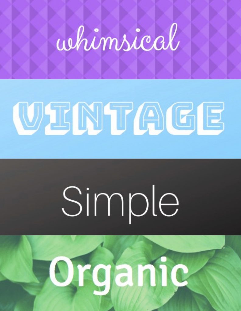
How do you choose the right brand font? Type is hugely expressive so making the right choice is crucial. During the branding process we often ask clients to describe how they envision their brand font. Not all clients may know the difference between serif and sans serif. It may be easier for them to describe what they are looking for using words like ‘whimsical’ or ‘traditional’.
Color
Color can be very powerful. And yes, there is a whole psychology surrounding the meaning behind different colors, which suggests that color can evoke feelings we don’t even know we have. Is this true? We can’t be sure, but it could be helpful place to start if you don’t know where to begin with your brand colors.
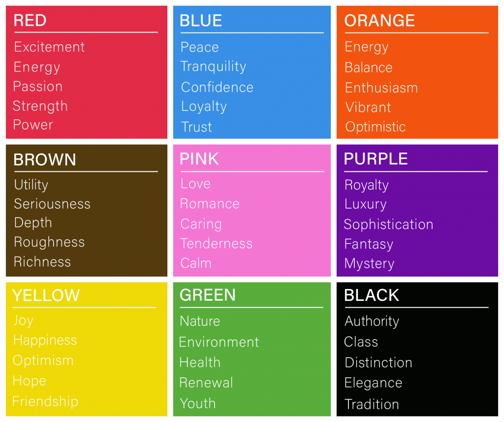
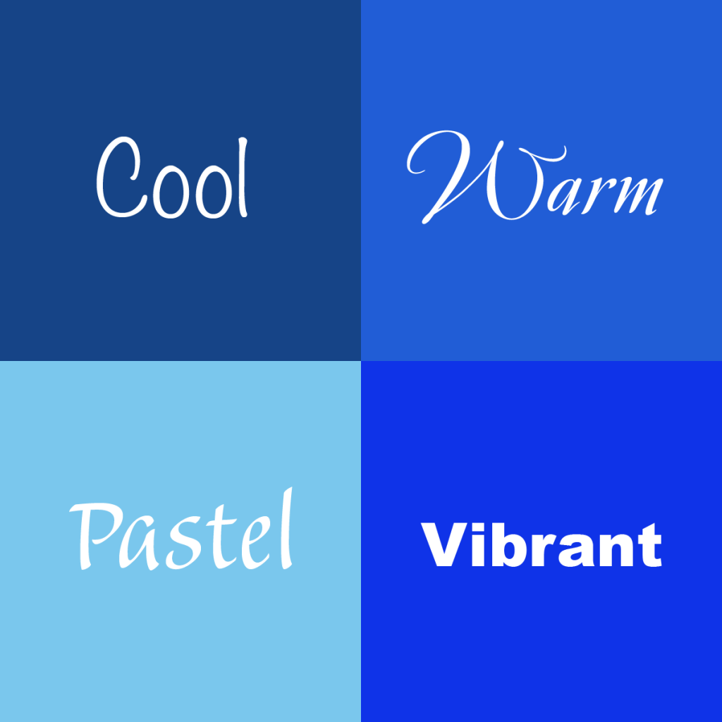
These associations should guide you to some general color decisions. Use these other descriptors to provide even more direction for your brand colors:
Imagery & Graphics
Just as your type and colors need to remain consistent across all your marketing materials, so does your imagery and graphics, which help us communicate ideas instantly. Since marketing is all about communicating, it makes sense that both are a big part of branding. Here are some ways to ensure you’re keeping things consistent:
- Choose a filter for your photography – Filers are an easy way to make images look consistent and professional.
- Create a set of brand shapes or icons – After these are professionally developed, share them with your entire team to use on internal and external communication pieces.
- Use imagery that highlights your brand colors – Whether you are using original or stock photography, find a way to highlight your brand’s signature colors. This will keep everything looking uniformed and professional.